This layout allows for optional header and text.
Banner
The Banner layout can be seen on the top of this page: the city skyline overlayed with two lines of text saying Content Group Image Layouts. The Banner layout displays a wide image with an optional text over this image. The text is center aligned vertically, but the horizontal alignment is managed by the content administrator. The Banner is usually selected as the first layout on the page but it can be placed anywhere.
Gallery
The Gallery layout allows displaying one or multiple large images, with captions, one at a time, with thumbnails to switch between the images. The captions are optional. Using the Gallery is optional but a page can have multiple Gallery layouts in any order. The Gallery background colour can be set independently, the caption colour can also be set.
Multiple Images
This layout displays multiple images at once, in a configurable responsive grid from 2 to 6 columns.

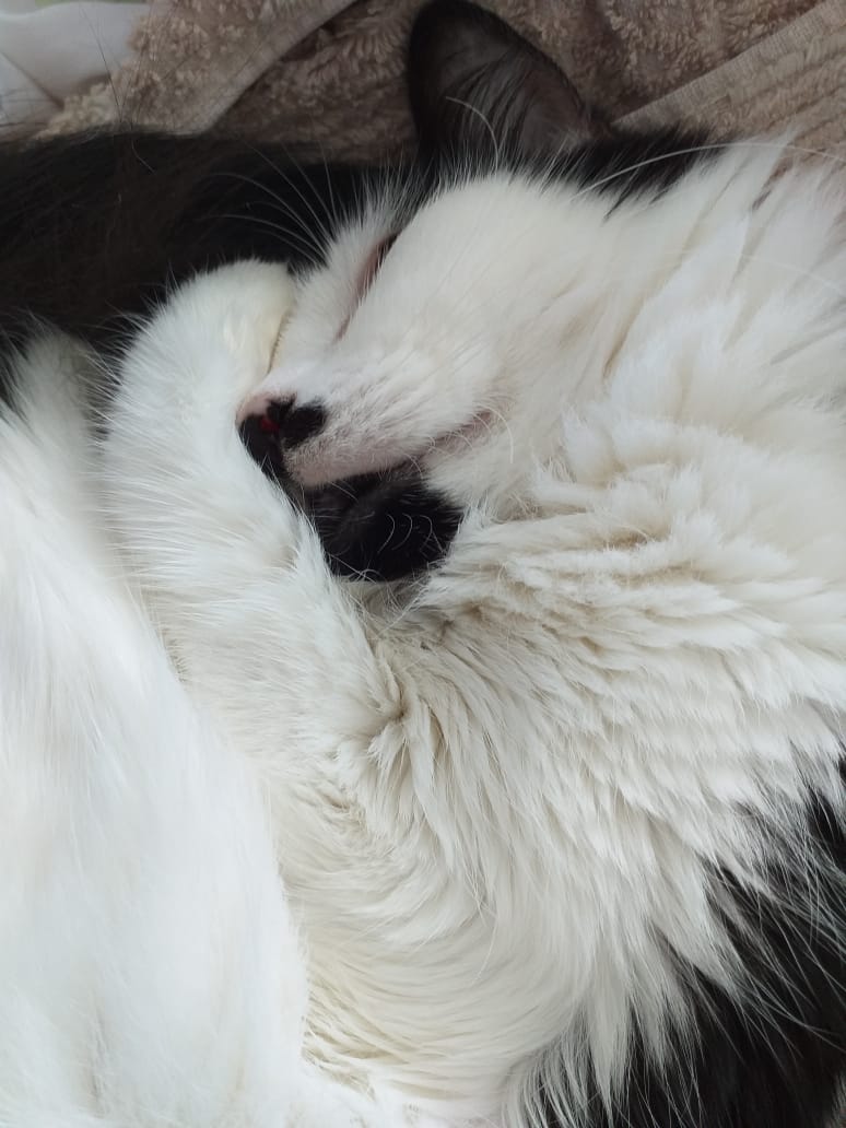
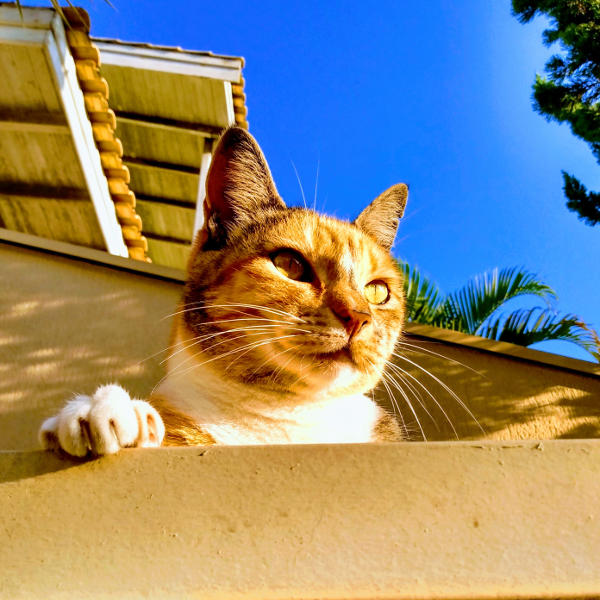
Image and Text
This is a layout that displays an image next to a WYSIWYG text.
Text and Image
This layout displays a text and an image side by side.
3 Image Text Boxes
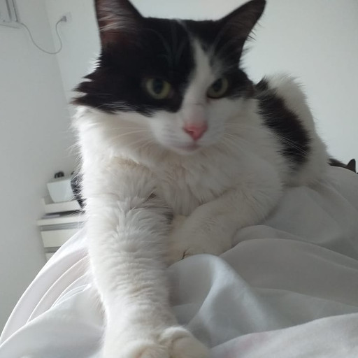
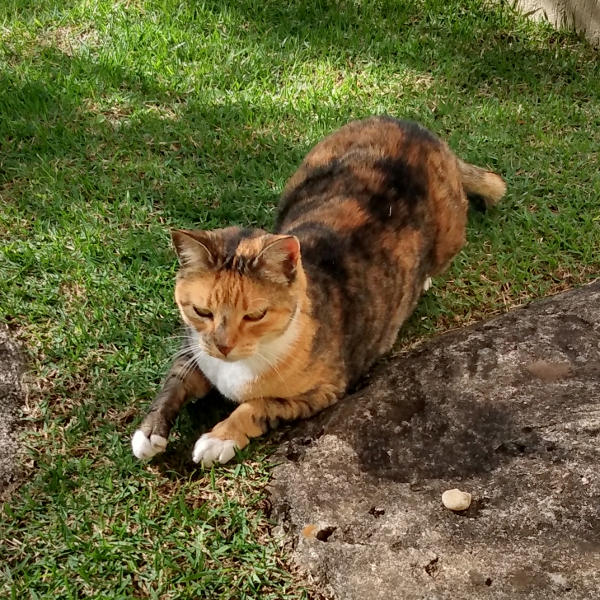
The necessary vertical alignments are set up automatically.
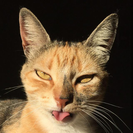
Even when the vertical alignment requires multiple lines.
The text takes a tabular format.
The images final format…
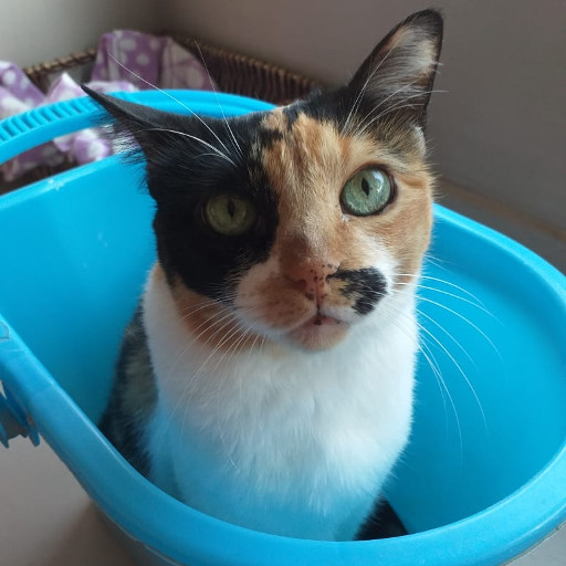
…depends on the aspect ratio of the images:
Square images end up round;
Portrait and landscape images end up as tall and wide ellipses, respectively.
3 Image Text Boxes
The necessary vertical alignments are set up automatically.
The images final format…


This layout allows for optional header and text.
Even when the vertical alignment requires multiple lines.
…depends on the aspect ratio of the images:
The text takes a tabular format.
Square images end up round;
Portrait and landscape images end up as tall and wide ellipses, respectively.


